A few years back, I had a brief fling with a blog I found called McMansion Hell. The site is designed and maintained by a young woman, Kate Wagner, who was a writer who studied architectural acoustics from Johns Hopkins University‘s Peabody Conservatory.[4] That’s noteworthy for two reasons: my son is a soon-to-be-graduate of Hopkins, and Peabody is the name of the Hopkins library that is one of the most gorgeous libraries in the universe.
I have never been a student of good architecture. But I am a glutton for good writing, and Wagner absolutely qualifies. Thus, I followed her blog for awhile as she torched the all-so-common McMansions, not for their ostentatious displays of wealth (though there was some of that), but more because of how they badly they often strayed from good architectural design. Traits such as balance, proportion and symmetry help define a well-designed building.
The faux pas that seemed to be the most common among designers of these suburban palaces is mixing design styles, most notably reflected in windows of varying shapes and sizes. That is an architectural no-no.
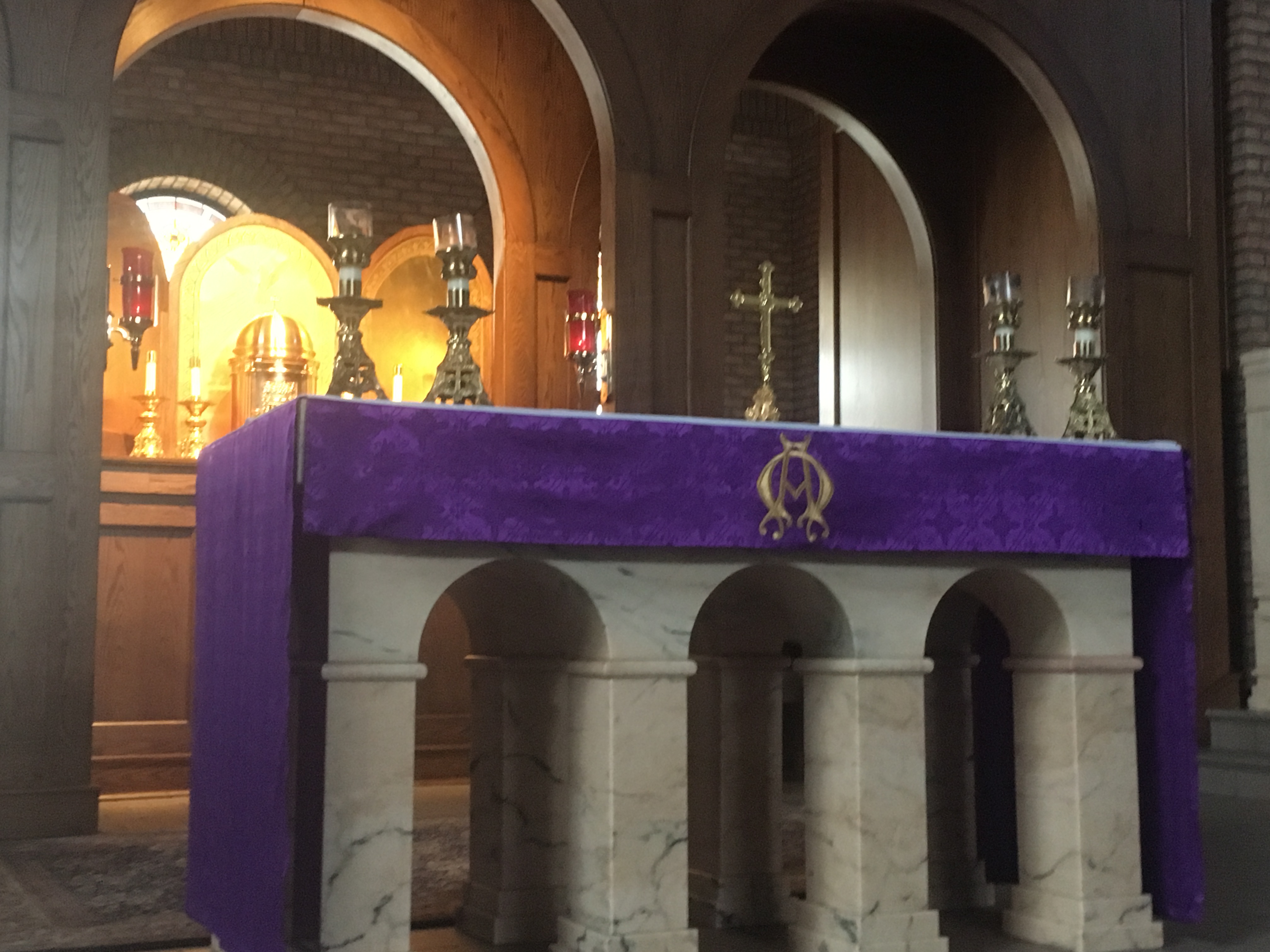
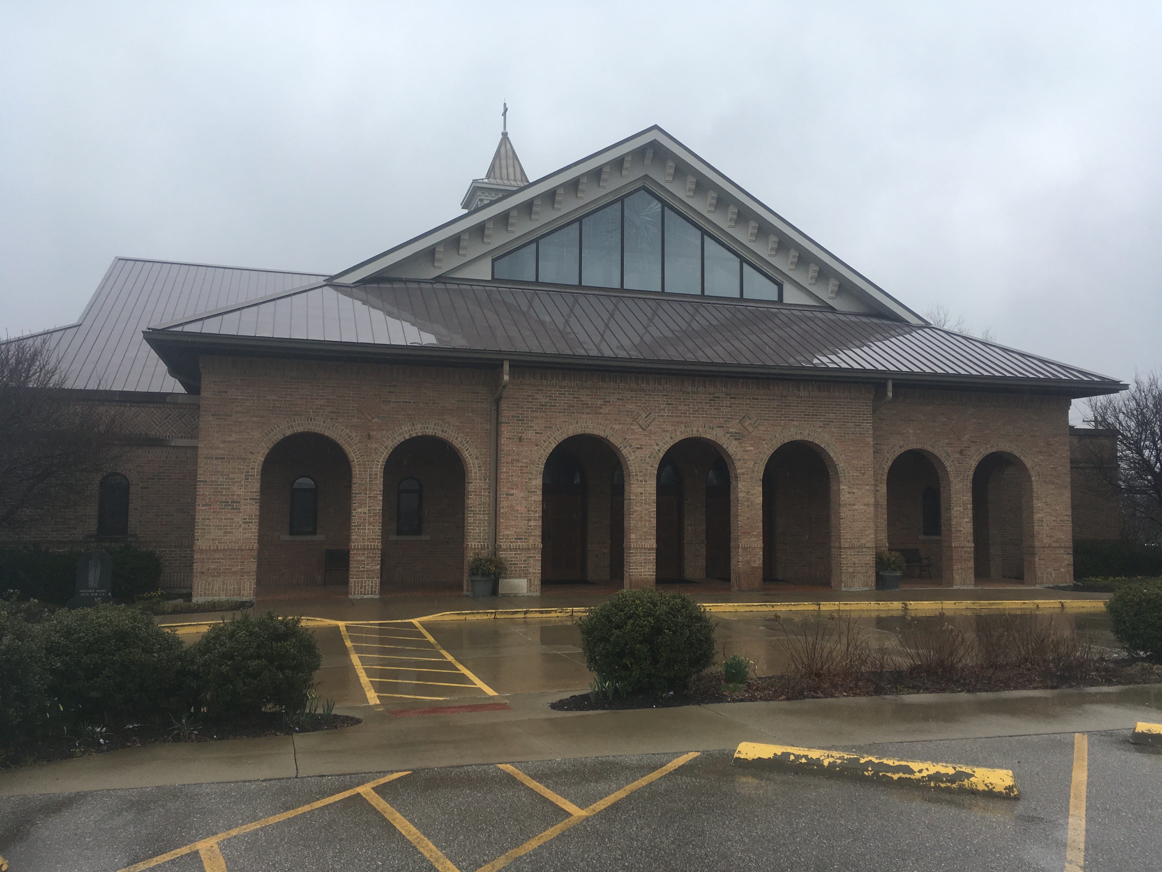
Which brings me to St. Cecilia, a mostly rural church located in Northern Kentucky, just outside the larger towns of Florence, Covington and Newport. I think Kate Wagner would have been quite pleased with the design work here. The church is beautiful inside and out. The arch is the overarching design trend, with series of three arches on display all over the church — at the altar, above the entrance to the church and with the windows. To my still-novice eye, it all flows together in a wonderful way.


